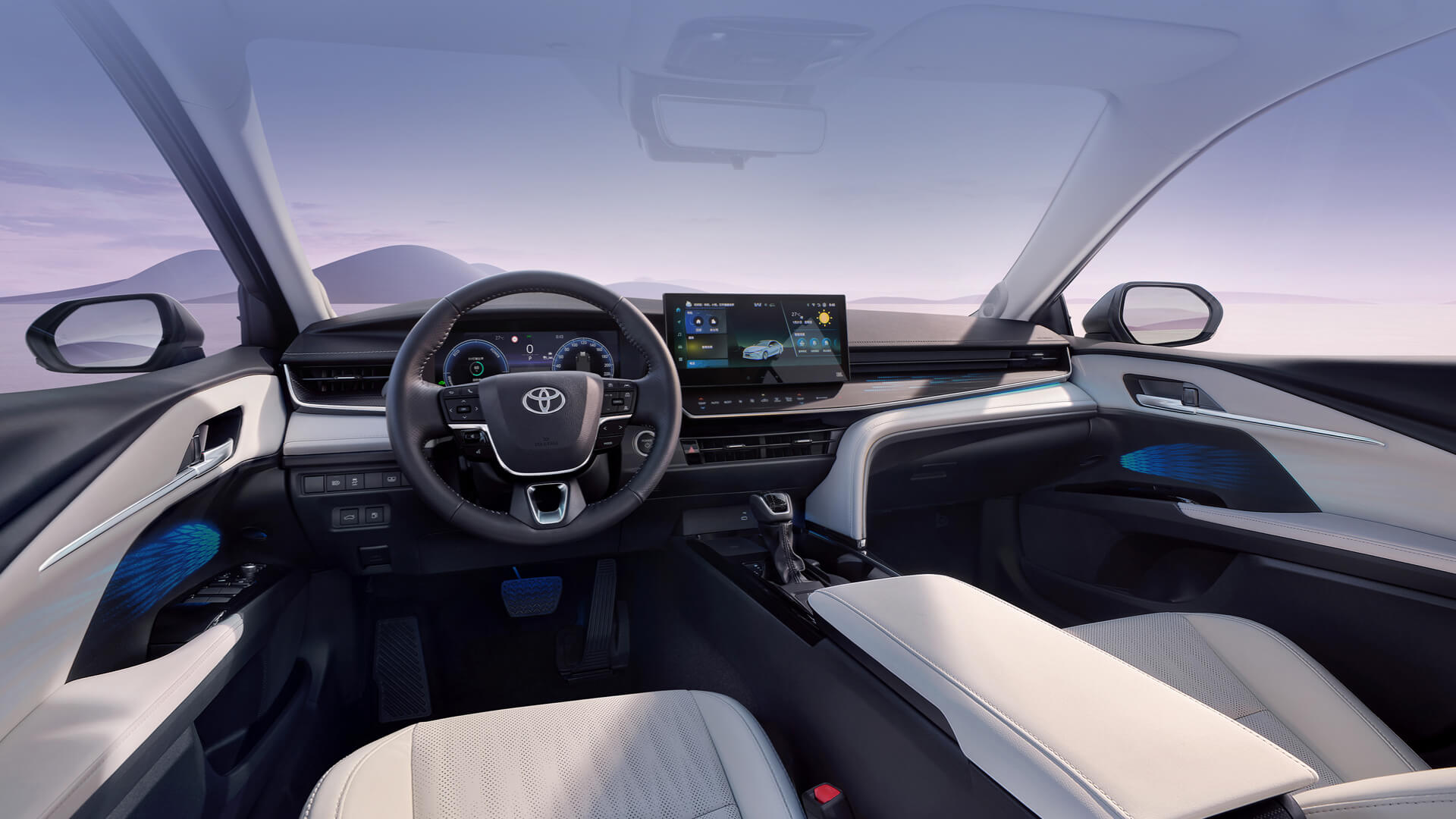

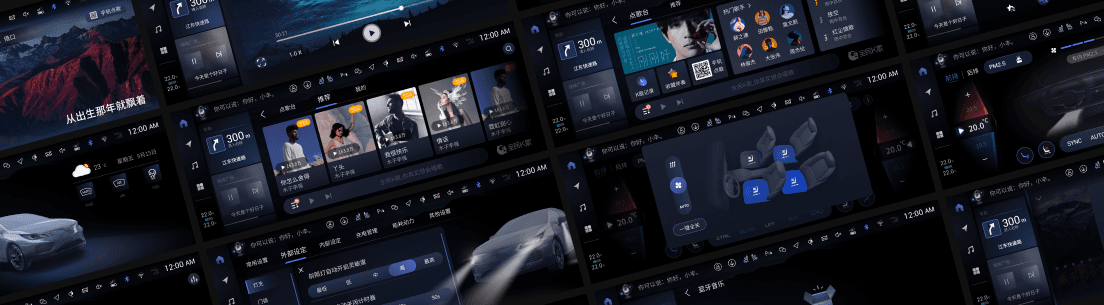
From 0 to 1, our team designed a HMI operation system OS for TOYOTA used in 23MM.
I took charged of several domains in UX design: Vehicle settings, Media, Privacy policy, etc..
Luckily working with TOYOTA, a global brand, inspired me in system design and management.
Time
2021.7 - 2023.3
My Role
UX Designer, UI Designer
Skills
Benchmark, User journey, UX design, UI design
TOYOTA
23MM
MID & HIGH
Tap here to see the launched cockpit
Chapter. 01
Way of working
💡

As UX Designer


功能式樣書.xlsx
Requirement


Analysis
基准
报告
趋势
Research
Proposal

Feasibility
Functionality
User experience
Review

A/B Test
...
Delivery
UI
3D
Dev
UX - Function
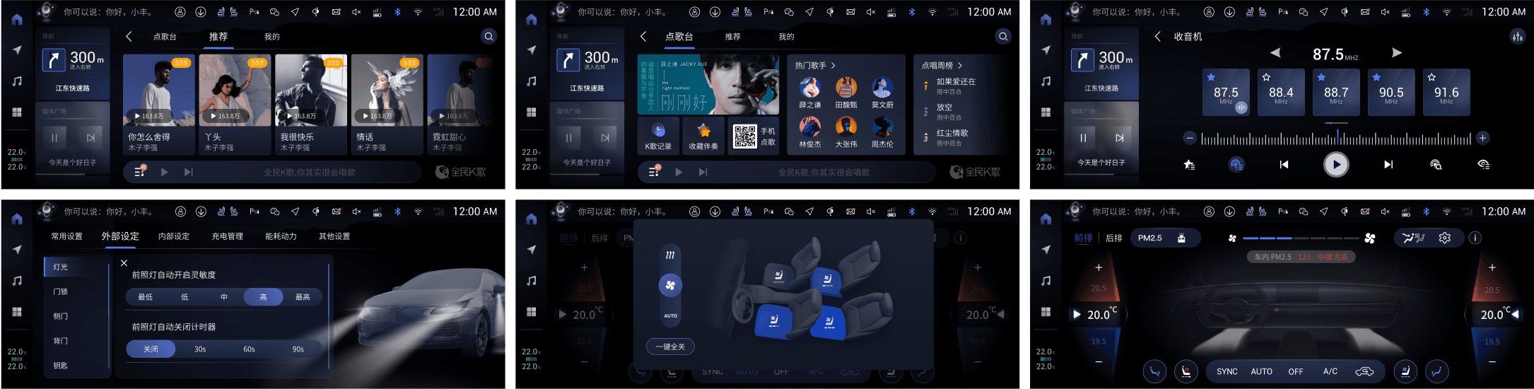
Main Functional Modules: Vehicle settings — including exterior and interior customization, energy management, scheduled charging, and driver assistance;
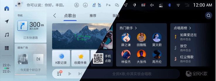
Online media (Tencent Aiquting), local media (Bluetooth and USB music), WeSing karaoke, calendar, and other infotainment features.
💡
As UI Designer

...
UX flows

Hi-Fi Screens
Theme

Visual design
Logic
Priority
Consistency
UX Review
Guideline
Brand Style
Stunning visual design
UI lead review
Dev
UI - Function
Main Functional Modules: Vehicle settings — including exterior and interior customization, online media (Tencent Aiquting), WeSing karaoke, and other in-car entertainment features.
Chapter. 02
Project Overview

Project Overview
Spanning over three years, our design team (10+ members) developed localized in-car system designs for Toyota China across both MID and HIGH platforms, and also proposed HMI concept designs for new Lexus models.
As a UX Designer, I was responsible for interaction design in two major areas — Vehicle Settings and Media. Vehicle Settings, as one of the core functions of the in-car system, are closely tied to both safety and user experience, and involve deep integration with vehicle signals. Through this work, I gained a deeper understanding of vehicle system architecture and human–machine interaction.
In addition, I also contributed as a UI Designer, focusing on the visual and interface design of selected Vehicle Settings and Media modules. The Media module posed greater challenges due to the presence of large amounts of uncontrolled UGC content, requiring careful design adaptation to various visual contexts. Other key challenges included differentiated designs for features like rankings and membership systems.
Chapter. 03
Practice: Vehicle Settings UX upgrade
10:32 18/7/2022

Compare to Mid platform, we upgrade the chip to 8155 in High platform.
Besides, there would be more features for vehicle settings.
Based on them, maybe we could try to reconsider how this function would be.
Get it. I’ll create several proposals.
?
How could it be better?
Mid

High
?
💡
Let’s analyze what we already have!
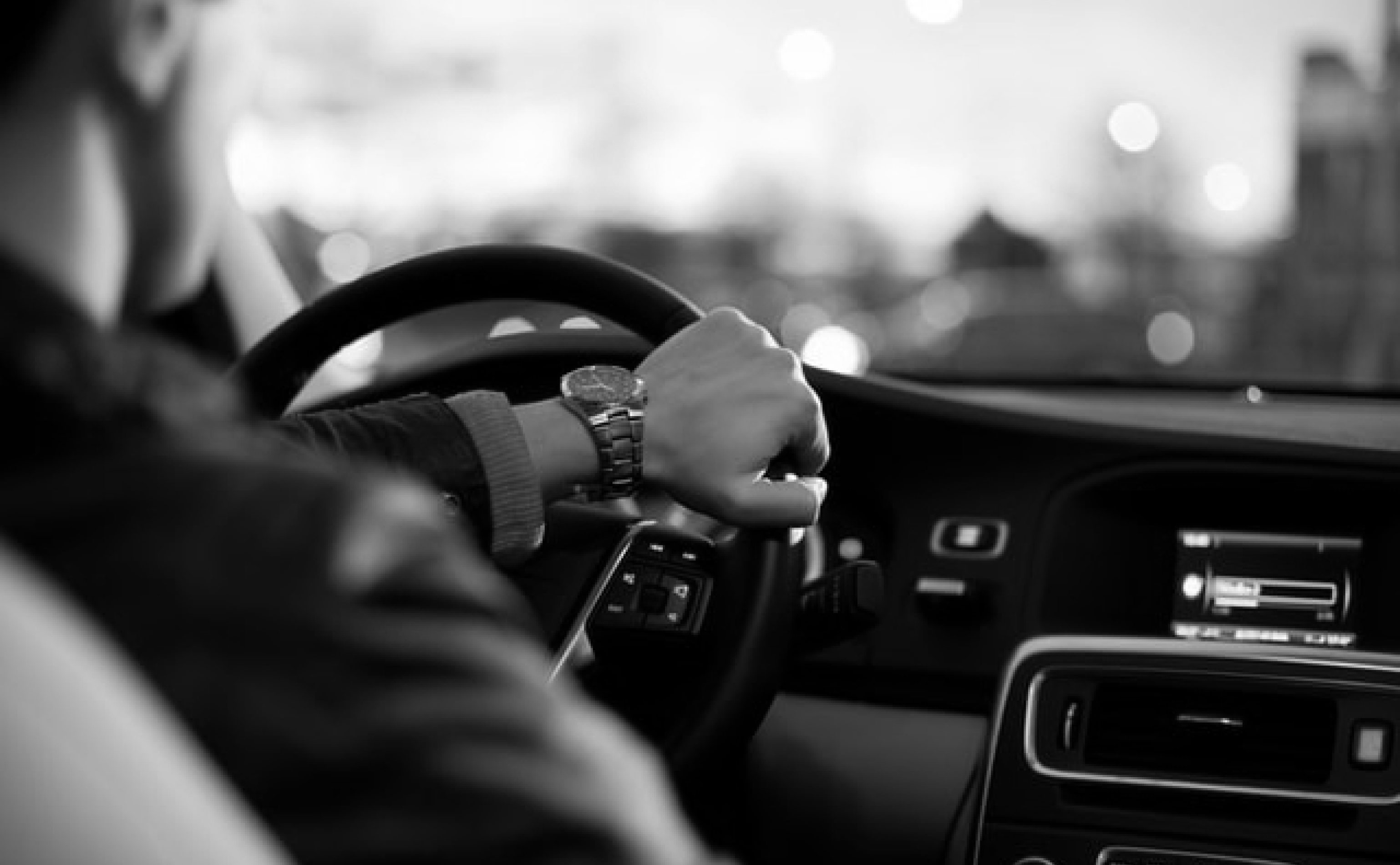
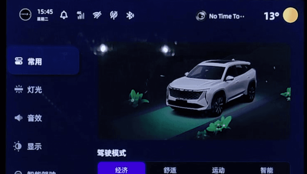
Vehicle Setting is a function that strongly correlated with driving.
To minimize driving distractions, the vehicle's interface should be designed to reduce operation time and cognitive load as much as possible.
But in Mid, the information architecture inevitable makes the user path long. Even though we have try to solve the problem by add the “Shortcut” as the first tab, there are still too many features could not be quickly accessed by the user.
At the same time, the features which primarily presented in text also increase the user's cognitive load and learning costs.
1. Pain point
Long User Path & High Learning Cost

2. Opportunity point
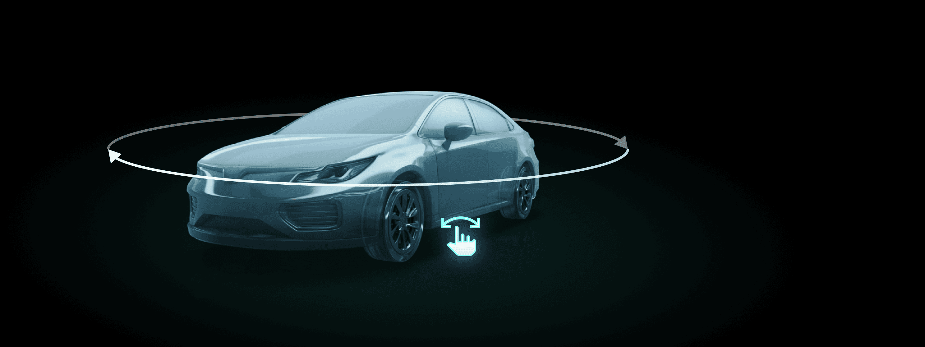
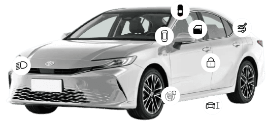
Hardware Upgrade Takes Interactive 3D model in
In Mid, the vehicle model is non-interactive because of the restriction of hardware. There definitely are animations of corresponding Vehicle Settings functions indicating how they work but consisted by rendered PNGs.
In High, the upgrade of hardware make interactive 3D model available, which is a more intuitive way for users to control and understand the function.
Maybe it’s an opportunty for us to utilize it to create better user experience for Vehicle Settings.
?
What are the exsisted solutions?
3. Benchmarks
Competitive research with vehicles of the same class

问界M7 | AITO M7
#New-in Brand
#China
¥250,000+
Non-interactive 3D vehicle model for all of the Vehicle control functions and reflects the vehicle real state.


理想L6 | Li Auto L6
#New-in Brand
#China
¥250,000+
Non-interactive 2D vehicle animations for part of the vehicle settings functions as additional information for users.

比亚迪唐 | BYD TANG
#Traditional Automaker
#China
¥170,000+
Non-interactive 2D vehicle animations for part of the vehicle settings functions as additional information for users.
吉利博越 | Geely BoYue
#Traditional Automaker
#China
¥83,000+
Non-interactive 2D vehicle animations for Drive Mode only.
本田 HR-V | HONDA HR-V
#Traditional Automaker
#Japan
¥115,900+
Non-interactive 2D vehicle pictures for every next-level entry of vehicle settings.


大众ID.3 | VW ID.3
#Traditional Automaker
#German
¥112,900+
Interactive 3D vehicle model for interior and exterior where attached by every entry. Only text lists in the detail setting screen.
Conclusion
The overall trend in Vehicle Settings is to use 3D car models to create a more intuitive experience for users.
But most of OEM’s only use non-interactive animations in Vehicle Settings now (2022).
?
Too much info and directions...
So what do users truly need?
4. Empathy mapping
Understand the primary users‘ real needs in the real use senarios.

I’m a driver
I need to keep my eyes on the road.
I can take several quick glances at the HU.
Maybe I’ll ask for help from Voice Assistant or my co-driver passenger.
I’m focus on driving and put my hands on the steering wheel.
The alert sounds in the car
The voice of the voice assistant
The navigation prompts
The media playing
The noise from outside
The conversations of passengers
Adjust my rearview mirror angle and other functions related to my driving, while drive.

1
Who?
2
What do I NEED to DO?
3
See?
4
Say?
5
What do I do?
6
Hear?
7
What do I THINK and FEEL?
PAINS: I fear driving risks if I can't adjust my rearview mirror angle in a timely manner.
GAINS: I need to quickly identify and locate the corresponding settings, and accurately adjust them while ensuring safe driving.
User needs
“I need to find the feature quickly while driving.”
“I need to know what each feature is used for.”
“I need something that is easy to use and control.”
?
Let’s converge it... How might we?
5. Insight
Transform user needs into design requirements.
Useage scenario
Driving
Driving & Stationary
Driving
User needs
“I need to find the feature quickly while driving.”
“I need to know what each feature is used for.”
“I need something that is easy to use and control.”
We might be...
Shorten user path
Increase priority of often-used-while-driving features
Add additional info or animation as a hint to explain how this setting used for.
Avoid complex and intricate operations
Place commonly used features in easily accessible areas.
💡
Then, try to design!
Before
After

🧠✍️🙇🏻♀
...
💡
Yea, I’ve got 2 proposals!
6. Design proposals
Propose multiple design concepts in different directions.
Mid
High - Proposal 1
车外
车内


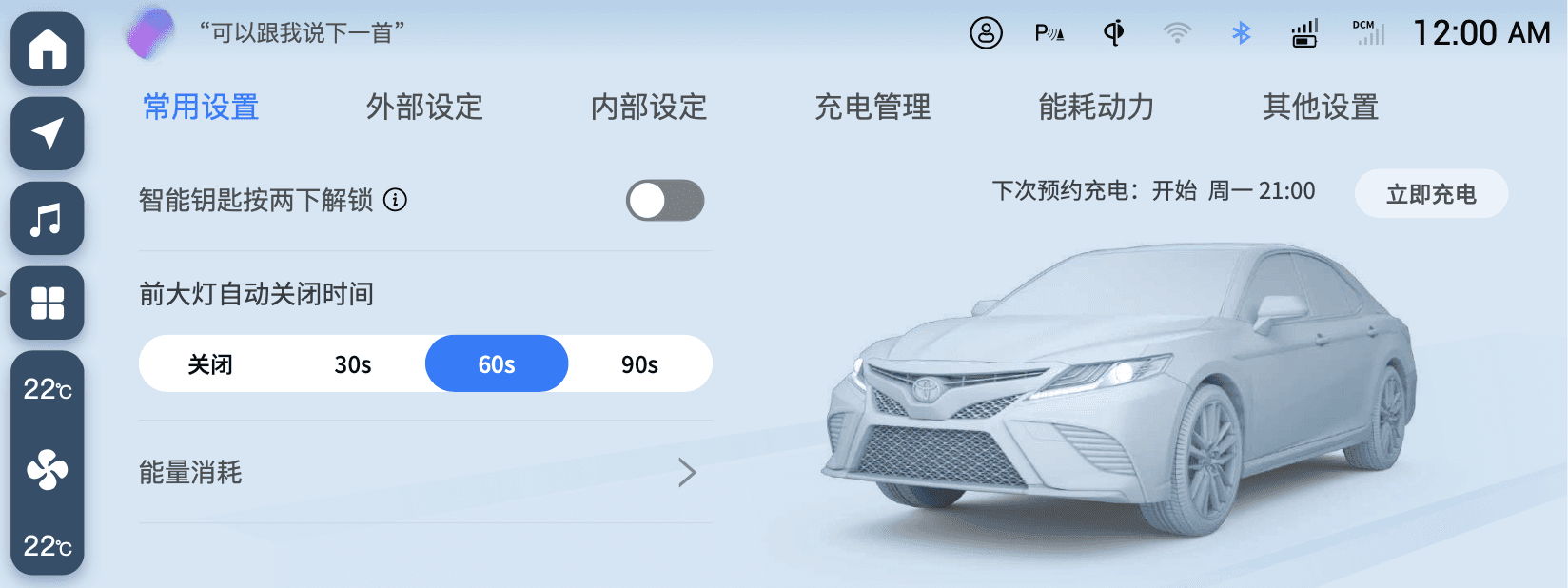
常用设置
外部设定
内部设定
充电管理
能耗动力
其他设置
下次预约充电:开始 周一 21:00
立即充电
智能钥匙按两下解锁
能量消耗
前大灯自动关闭时间
关闭
30秒
60秒
90秒
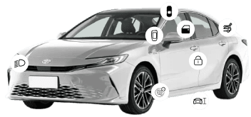
High - Proposal 2

Clearer hierarchy
Lesser effort
?
Which proposal is better for us?
7. Analyze and compare
Choose one best for further design.
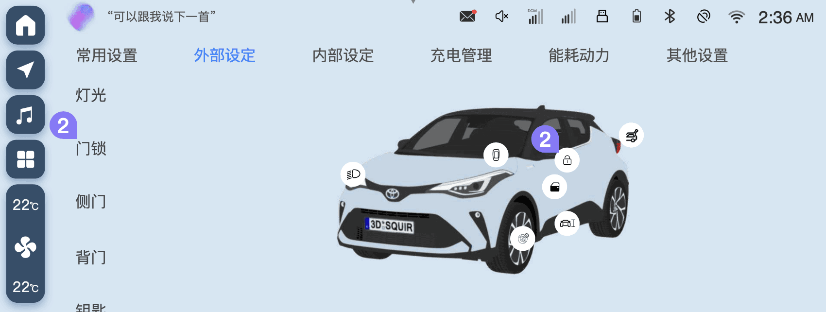
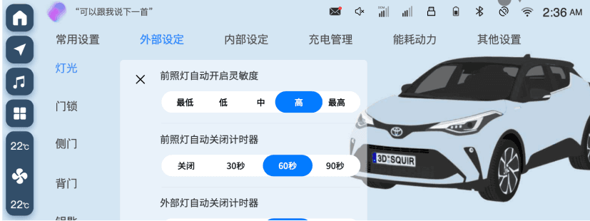
Task: Adjust “Exterior light”
Screen
Mid
High - Proposal 1
High - Proposal 2
VehicleSettings
-
Homepage
VehicleSettings
-
Exterior
VehicleSettings
-
Exterior
-
Light

车外
车内


常用设置
外部设定
内部设定
充电管理
能耗动力
其他设置
下次预约充电:开始 周一 21:00
立即充电
智能钥匙按两下解锁
能量消耗
前大灯自动关闭时间
关闭
30秒
60秒
90秒

常用设置
外部设定
内部设定
充电管理
能耗动力
其他设置
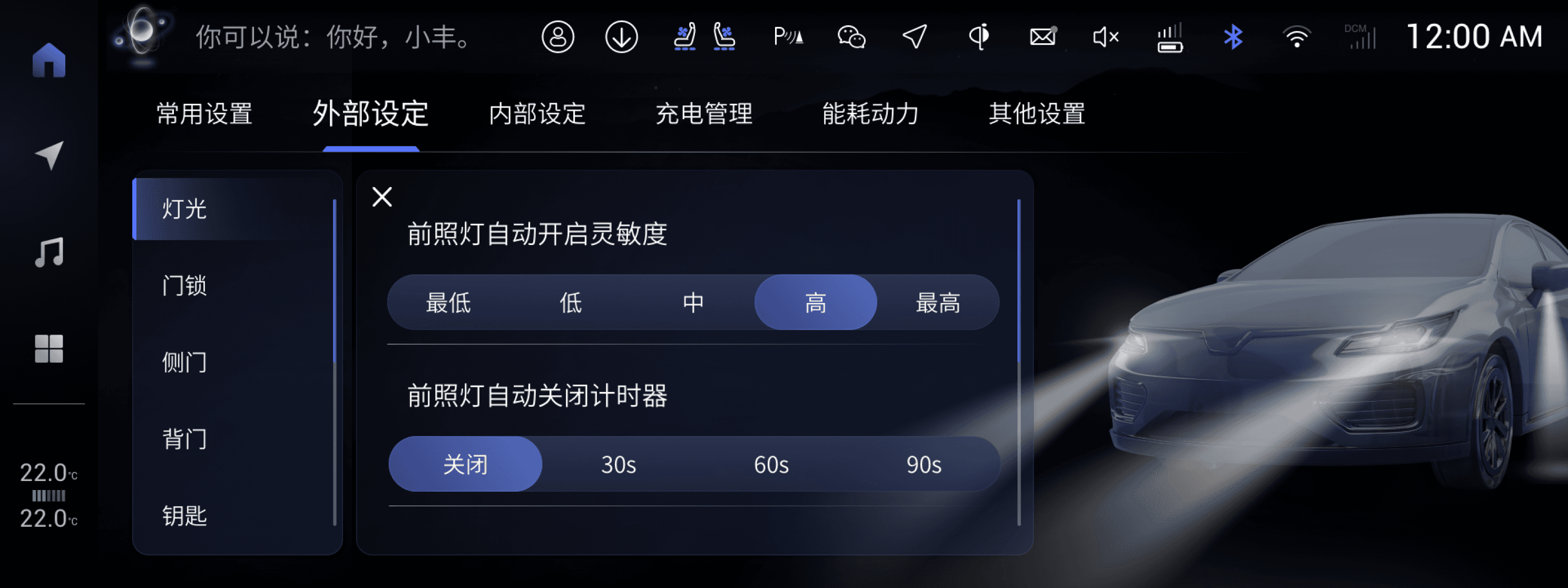
灯光
门锁
侧门
背门
钥匙
高度控制
高度控制
前照灯自动开启灵敏度
最低
低
中
高
最高
前照灯自动关闭计时器
关闭
30秒
60秒
90秒

灯光
门锁
侧门
背门
钥匙
高度控制
高度控制
前照灯自动开启灵敏度
最低
低
中
高
最高
前照灯自动关闭计时器
关闭
30秒
60秒
90秒
外部灯自动关闭计时器
关闭
30秒
60秒
90秒
Comment
/
✅Pros:
1. Lesser effort for design and dev for retaining the same layout.
2. Shorter user path.
❌Cons:
Redundent entries and information.
✅Pros:
1. More space for 3D car model after removing the horizontal tab.
2. Shorter user path.
3. Clearer structure and hierarchy.
❌Cons:
Couldn’t easily switch from every sub-settings via horizontal tab.
Why choose Proposal 2?
Proposal 2 is more focus on 3D car model. The operation for users is more intuitive and clear.
There would be more features added in High so we need more space for them. It’s better to remove the horizontal tab.
The effort for layout redesign is acceptable.
📢
How does it improve the user experience?
1
Shorter
User Path
Kill 1 step in user path.
Quickly control.

灯光
门锁
侧门
背门
钥匙
高度控制
高度控制
前照灯自动开启灵敏度
最低
低
中
高
最高
前照灯自动关闭计时器
关闭
30秒
60秒
90秒
外部灯自动关闭计时器
关闭
30秒
60秒
90秒
Before
After
2
3D car model connects the physical world and virtual screen, making experience more intuitive
More Intuitive Operation
on 3D Car Model

3
Reselect the shortcuts that are more frequently to be used while driving and always using “Tap” to trigger an action.
Choose the Shortcuts
that Easy to Use
💡
Final Screen in the real car
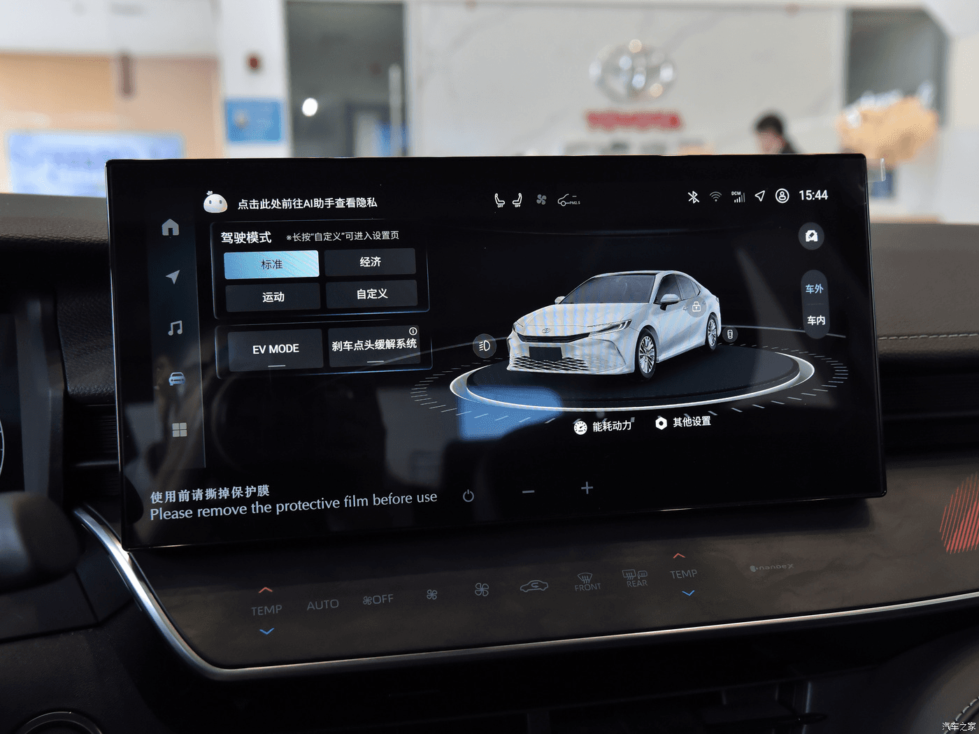

18:16 3/31/2023
Good job!
We’re glad that we could deliver a better experience for users in High.
I’ve also learnt a lot from redesigning it.
Vehicle settings is an important function that relates to driving experience and safety.
We need to give a lot of thought to drive distraction and short operation time especially in Vehicle settings.
There’s also one special for Vehicle settings that, there’re different optional features for different carlines. So it’s important to consider the situation that most of the features in the screen may not set up in the car. What if the layout would be in this case?
Anyways, yeah, for me it’s a memorable experience ☺️
Contact
Chloe / Chen Longping
UIUX Designer